Effective advertising is undoubtedly crucial to the success of any restaurant business. Your restaurant’s marketing efforts should focus on two goals: getting customers through the door and encouraging them to spend significantly once they’re there. Both components of restaurant menu design are crucial.
Now let’s examine one of the most fundamental problems with the second half of your strategy. It’s crucial to consider how your menu looks. Menu creation has evolved into a near-scientific art form. Studies have been done to illustrate what people glance at when they open a menu, so you can use that information to organize better and design your layout.
To help you revamp your menus and make them more successful, we’ve compiled a list of six easy steps to take.
- Pick the Most Suitable Layout
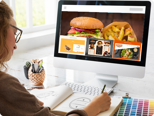
Designing a menu that effectively represents your business is a challenging feat. The menu is the business card for your restaurant; thus, it should reflect the atmosphere and aesthetics of your establishment. A wrong first impression is all it takes for a poorly crafted menu to sink a restaurant.
- Put the Spotlight on your Top-Selling Products
Some restaurant owners mistakenly believe that promoting their least popular dishes is more important than promoting their most popular ones. Actually, you ought to be taking the exact opposite action. The best strategy to ensure repeat customers at your restaurant is to advertise your top-selling meals. Surely there must be some logic to the success of a particular dish. Customers will return for fan favorites and may even branch out to try new items. That’s why you should always put the most sought-after dishes near each category’s top of the list.
- Employ Iconic and Symbolic Representation
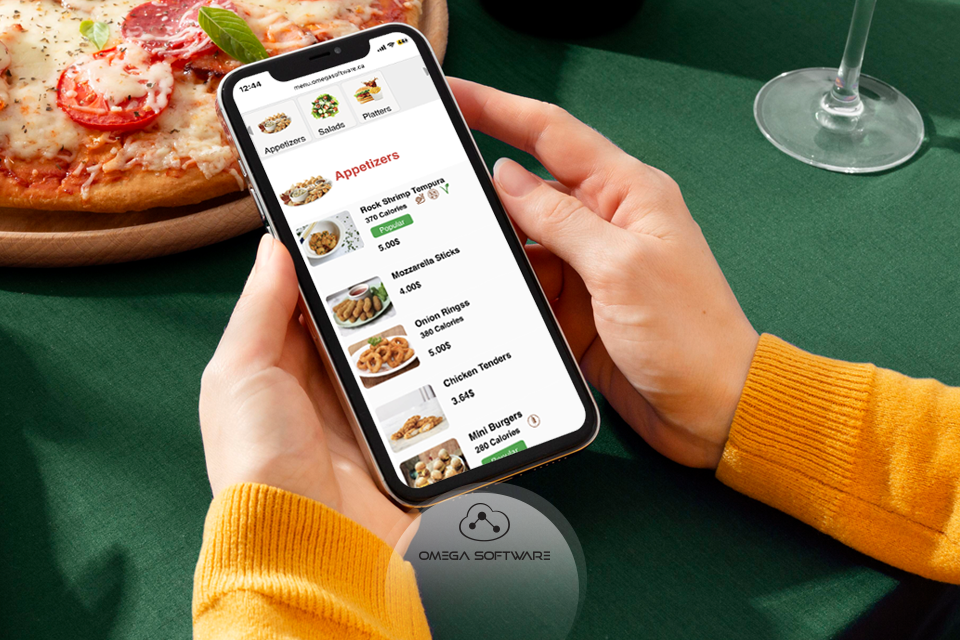
Research shows that including icons and symbols next to menu choices increases their likelihood of being selected. Furthermore, they can enhance the menu’s overall look and readability. A star next to a menu item might signal to customers that it is either exceptionally tasty or much sought after. Additionally, instead of writing out the goods that are vegetarian or vegan or creating a separate area for them, you may simply use a symbol.

- Abandon Currency Indicators
Your menu’s primary focus should be the items, not their prices. It’s very uncommon for restaurants to lose money when they try to attract customers by advertising deals like cheap menus or discounted items. It’s also recommended that the text size of the prices be reduced. Either make the prices less prominent than the rest of the description or make everything the same size. Another smart strategy for diverting attention away from the cost is omitting the currency sign so that customers choose their meals based on how appetizing they appear and sound, not on price.
- Be Sure to Pick Out some Pleasant Hues
Make your color choices in accordance with the restaurant’s motif and its intended clientele. The color scheme of a restaurant has a significant psychological impact on customers, both in terms of setting the mood and drawing attention to certain dishes.
It’s no secret that color can convey much information. Do you ever wonder why restaurants and fast food chains like red font and background? Experts concur that:
- Red causes hunger in people.
- Yellow is a color that draws attention.
- The color blue has a relaxing effect.
- Numerous health food establishments utilize the color green since it is commonly associated with the outdoors and nature.
Hence, consider the mood you want to evoke in diners while deciding menu colors.
- Minimize Long Descriptions
When describing your menu items to clients, less really is more. Keep your explanation brief and to the point rather than listing every component and crafting a flowery description befitting a magazine review. Many restaurateurs use every inch of their menus, but it’s unnecessary. Menus are more legible and enjoyable to navigate when there is some white space between items. The same holds for visuals. Having attractive photographs of some of your signature meals is appreciated, but this is optional for some items on the menu. Additionally, if you plan on including images, be sure experts rather than your smartphone shot them.

As mentioned above, several wonderful menu-building techniques exist, but have you ever wondered how they can be feasible and simpler? The Omega POS is a tool that may help you create a fantastic menu and boost your business’s earnings. Here’s how.
How a POS Software Assists in Developing a Spectacular Restaurant Menu
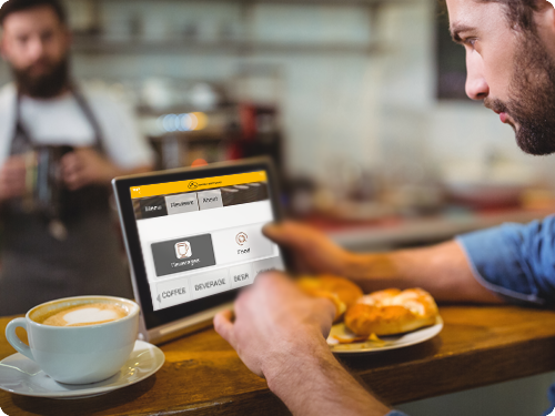
Designing a menu might be challenging for a restaurant with seating for customers. In this case, the restaurant POS system can be a great asset by allowing you to construct an efficient restaurant by menu matrix.
- Omega POS graphs your most and least profitable menu items. It’s easy to gain a quick overview of each menu item’s sales volume and profit margin by making a menu matrix.
- Omega POS allows you to present a comprehensive menu to your consumers, including information about the components, nutritional value, and preparation procedure.
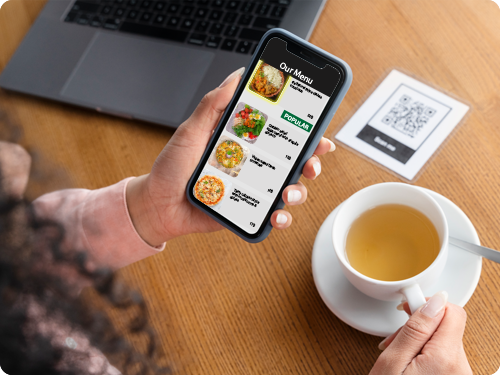
- Omega POS offers a digital menu through which customers can customize their meals and are free to select their preferred with a wide variety of toppings, sauces, and extras.
- You can set your Omega POS software to show prices in whatever currency you prefer. This simplifies the process of updating the menus of various restaurant locations in different countries using different currencies.
Wrap Up!

The success of your restaurant depends on your ability to attract customers with an exceptional, user-friendly menu that does justice to your business. The rise of contactless ordering has paved the way for exciting new ways digital menus may be presented. The POS software industry is worth $9.3 billion at the moment, and by 2027, it is expected to reach $18.1 billion. Hence, to keep up with the times, it’s ideal to think about switching to digital menus. You must implement Omega POS into your restaurant business to speed up adoption and reap various benefits.
It’s time to modernize and design a digital menu!

